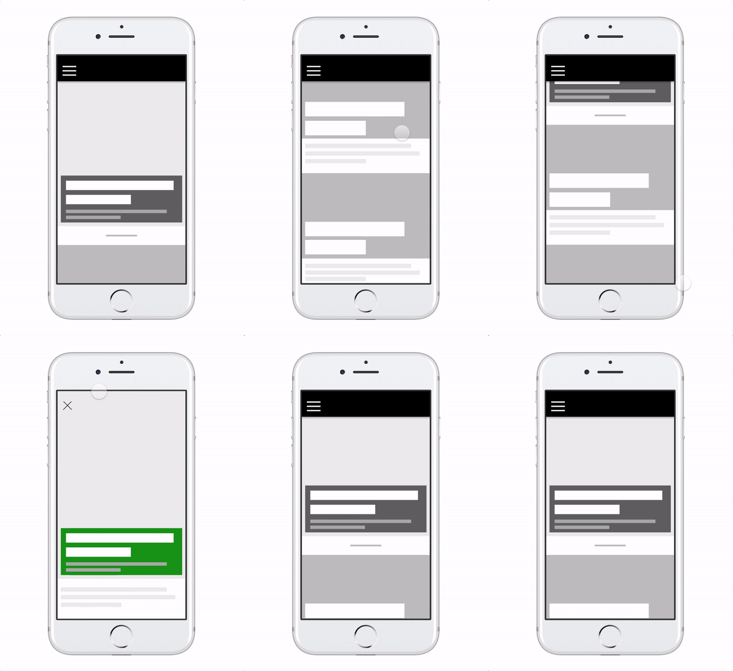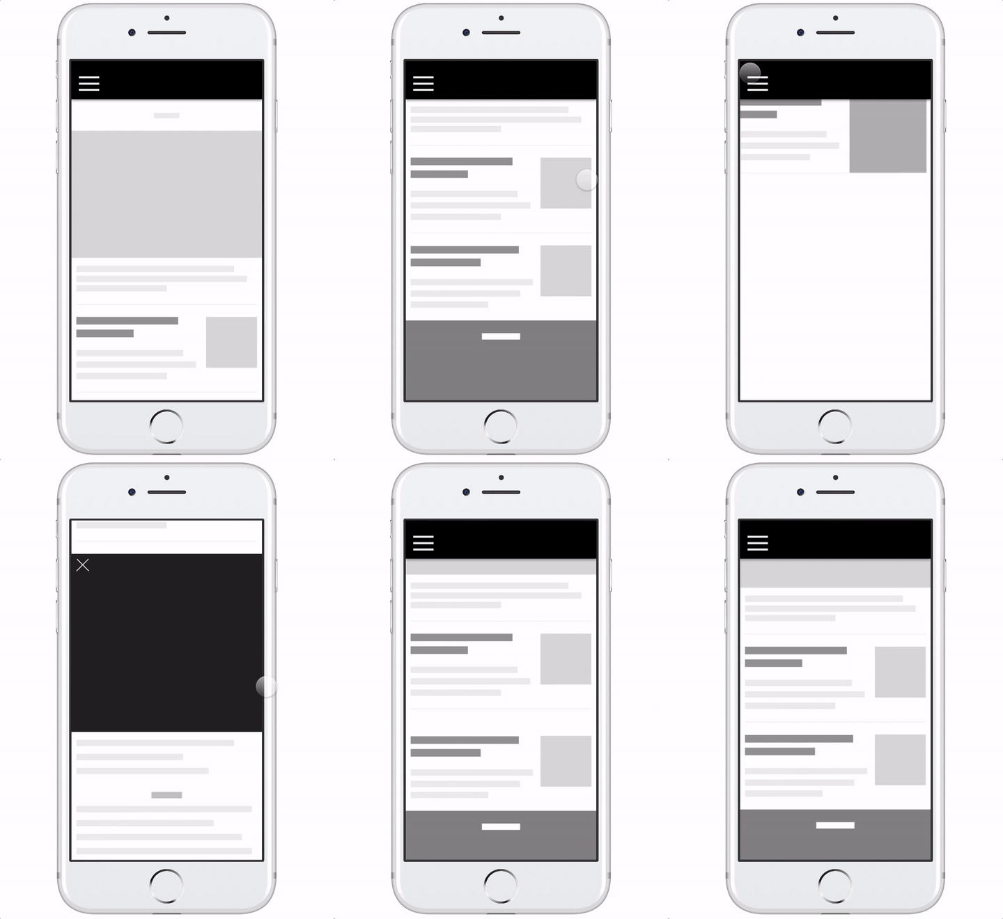
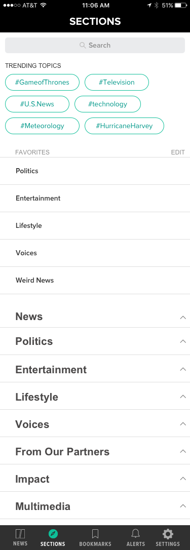
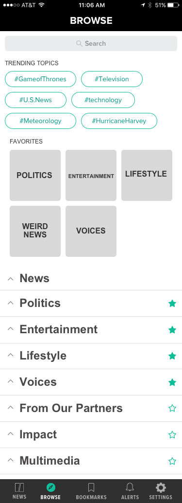
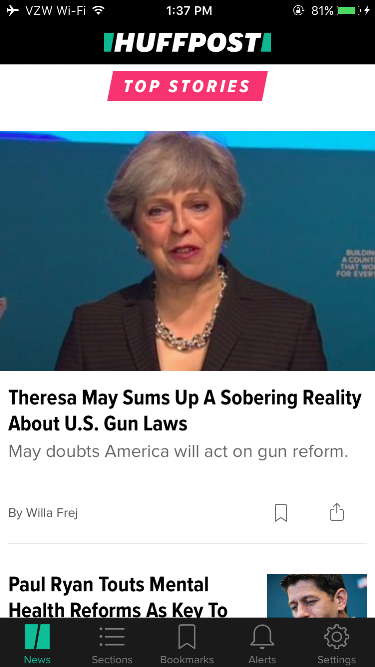
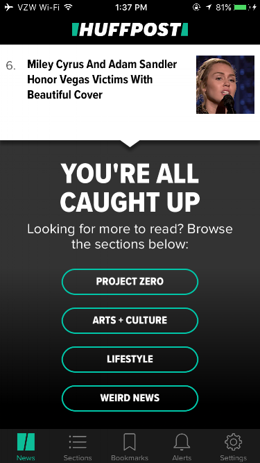
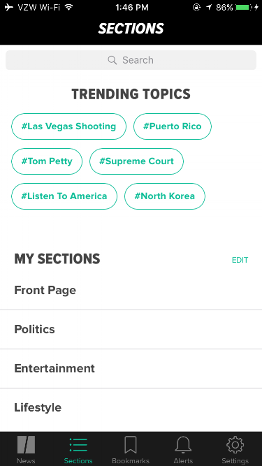
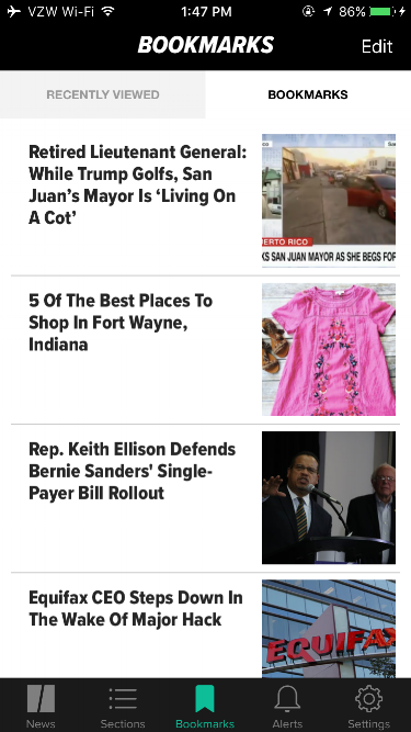
I re-organized the HuffPost app’s navigation from a single menu button to a tab bar, which proved to be successful in increasing engagement and reviews. App Store reviews increased from 2.5 to 4.6 stars following the launch of the new information architecture and navigation within the app. I designed animations for opening and closing article pages, and created a mechanism for smooth swiping between articles instead of having to return to the homepage to view other stories.
Wireframes
When testing the new design, I learned that placing entry points to different topics throughout the app helped people navigate more naturally between articles. I made sure to include different entry points to news topics throughout the main news feed and article pages.


Visual Design
Exploring Animations
I'm currently exploring animations and other micro-interactions to make the app more delightful to use. I created the custom animations below with Framer, a coffeescript-based interactive design tool.